Network Graphs in Google Sheets
How to visualize organizational networks using only the Google Apps Script environment
Introduction
A graph is a pair (V, A) where V is an arbitrary set and A is a subset of V², where V² is the set of all unordered pairs of elements of V. The elements of V are called vertices, and the elements of A are called edges [1]. If the edges have an associated direction (indicated by an arrow in the graphic representation), we have a digraph (oriented graph) [2].
Some examples of graph applications are:
- Movements of pieces on a chessboard
- Determining the shortest path between two points
- Determining the maximum flow between two points
- Chemical bond analysis
- Organizational network analysis
Here, we are going to talk about the creation of graphs in the scope of Organizational Network Analysis, which consists of a methodology to analyze collaboration ties, information flows, personal relationships and guiding practices that permeate the organization [3].
Graphs and Organizational Networks
There are several available tools for creating graphs, whether they are more complex and require some programming, or simpler and more direct (always having a trade off in both cases). The following is an example of a network using graphs. Note: It is possible to interact with the object.
Despite all possible means of generating this kind of visualization, they are not easy to find in popular graphic tools such as excel, Google Sheets, Google Data Studio, and others. Even Power BI, which is one of the most popular data visualization platforms today, we depend on marketplace visuals to build graphs [4].
And that’s when this section comes in. There is a very interesting way to generate organizational networks visualizations in Google Sheets, using some programming in the tool’s built-in development environment, which proves to be a convenient way to validate databases, get quick insights and sketch visualizations.
Google Apps Script
Google Apps Script is a development platform that simplifies and accelerates the creation of applications that interact with Google Workspace. As a first step, codes are written in JavaScript, and it is possible to access built-in libraries for main applications, such as Gmail, Calendar, Player, Sheets, among others. There is no need to install anything, as the code editor is provided directly into the browser, and the scripts are executed on Google’s servers [5].
The complete documentation of the platform can be found here. THere’s a demo on how to access the integrated development environment using Google Sheets.

Note that the original environment background is white. For those who are a dark mode fan (like me), all you have to do is use the AppsScript Color extension from Google Chrome.
Creating the Graph
First, we will organize the data based on the format requested to generate the chart. The next figure shows the expected attributes.
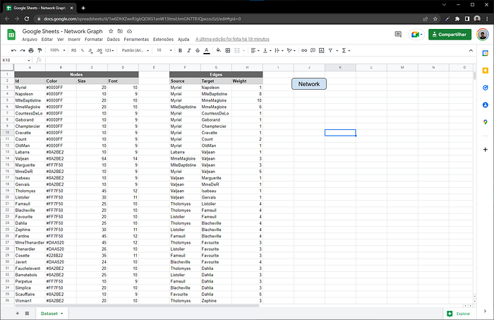
For the vertices (or nodes), the following attributes will be present:
- Id: identification of the vertex
- Color: hexadecimal code for the vertex color
- Size: vertex size, according how many times it connects to another vertex
- Font: interpolating between two font values to optimize visualization, resulting in larger fonts for more relevant elements
For edges, the attributes will be:
- Source: the starting vertex
- Target: the arrival vertex
- Weight: the weight of each connection, representatively translating the volume of occurrences for this pair of nodes (normalized between 0 and 1)
The dataset is from the Star Wars universe, and it has been downloaded from Kaggle.
The next step is to write the script that will collect the data from the spreadsheet, so that you have a dynamic source of information to plot the graph. This will allow you to generate an organizational network for any data (if you are a Star Trek fan, for instance).
Based on the above code, the getData() will return a JSON object, which will be used by the script that renders the view.
Apart from the codes in Google Scripts (JavaScript with special libraries), it is possible to write HTML codes on the environment, further increasing the possibilities of the tool. This allows us to create (and publish!) web applications [6], along with several other possibilities, such as creating a graph in Google Sheets. So, here is the code that will create the chart.
The library used to build the graph was Cytoscape.js, quite versatile and powerful for this type of visualization. You will find the complete documentation here. An important section of the code is at line 24:
google.script.run.withSuccessHandler(printRet).withFailureHandler(printRet).getData();which is the client-side API responsible for communication between App Script functions and HTML pages, enabling integration between files. Note that, in the case above, we used withSuccessHandler() and withFailureHandler(), both responsible for returning a function for each case: pass or fail in the APl call.
Before finishing the coding step, we have the last two functions (in JavaScript): the reserved function doGet(), responsible for gathering the HTML output, and the printGraph(), which collects the output of HTML code and displays it in a dialogue box (in the Google Sheets user interface).
Last but not least, the result! By running the printGraph(), we have our organizational network, as shown below.

There are several possibilities to customise the output obtained, since the Cytoscape.js library is almost exclusively dedicated to plotting networked charts. It is possible to spend (invest) hours and hours having fun with the documentation.
Deep Dive into Analytics
Now that we have generated our organizational network, let’s talk about four different personas within the network. First, a few considerations about the chart:
- The colors were obtained through a community detection analysis
- The edges have different thicknesses, referring to the number of times a given pair of vertices is related in the novel (thicker vertices equal to greater interaction between those characters)
- The size of the vertices refers to the number of times that character is mentioned in the novel, going through a treatment (grouping by range) for the visualization become more harmonious
- The layout of the network is obtained using “layout_nicely” from the igraph library, which takes into account the force of attraction between vertices
Next, the representation of the complete network.
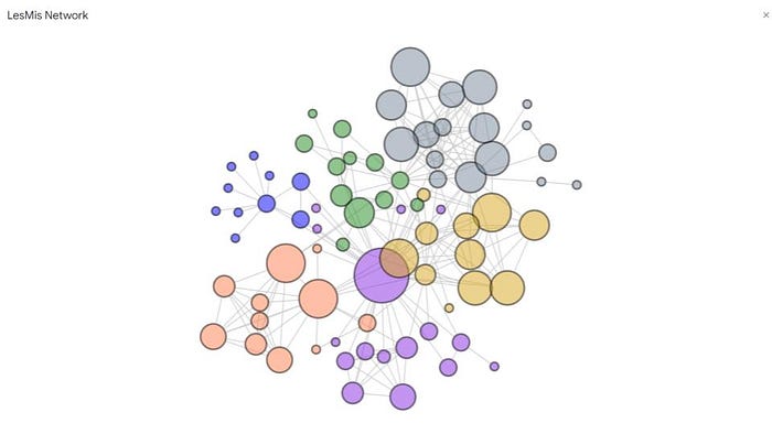
Here is a more interactive representation of the complete network.
Central Connectors
Central connectors are perhaps the first profiles to attract more attention in an organizational network. In case of using the size of the vertices as additional information, they will be the largest ones in a network, depending on the number of connections that it has. The figure below highlights a central connector, as well as all the people connecting with this person.
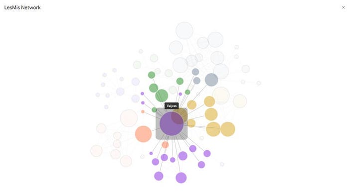
In addition to the number of connections, a central connector is also characterized by the plurality of these connections, being a person who interfaces with different groups within the network, thus becoming an influencer within the network, in other words, someone that people naturally turn to for subjects, establishing relationships with different people and areas.
Boundary Spanners
The second persona in an organizational network is the boundary spanner. In case of using colors as additional information, this type of profile interfaces between different colors, being someone who takes information from one area to another. The figure below highlights a boundary spanner, as well as all the people connecting with this person.
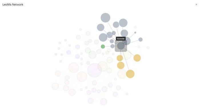
Boundary spanners share with central connectors the quality of carrying information between areas. However, in this case, this type of persona is not necessarily a reference within the network, nor does it have a high number of connections.
The main point here is precisely to be an interface between two or more areas, thus becoming a fundamental piece of the flow of information between different groups in a network.
Brokers
Brokers play a crucial role within an organizational network. This type of profile is relatively independent of the addition of extra attributes such as colors and vertex sizes, since the main quality of brokers is to keep people or silos together with the rest of the network. The figure below highlights a broker, as well as all the people connecting with this person.
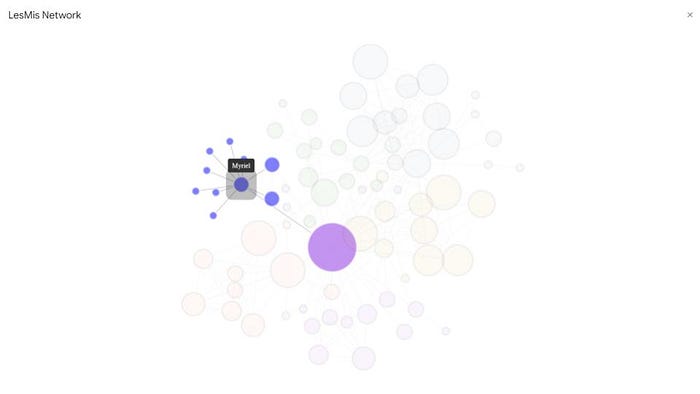
Note that the concept of union, in the case above, applies to a certain group of people who would no longer have a connection to the network if the highlighted vertex ceases to exist. However, brokers also appear connecting areas that don’t naturally interact, playing a fundamental role in the flow of information between them.
Thus, it can be concluded that a broker has a similarity to boundary spanners in the sense of being an interface that makes the flow of information easier, at the same time that it assumes the role of central connector as it is a reference for certain people, even without having a high number of connections.
Peripheral Players
Finally, the fourth type of persona to be analyzed in this article is the peripheral player. Usually located at the edges of networks, they are also easily identified without adding attributes such as color and size, since they have few (or, more emphatically, only one) connection in the network. The figure below highlights a peripheral player, as well as all the people connecting with this person.
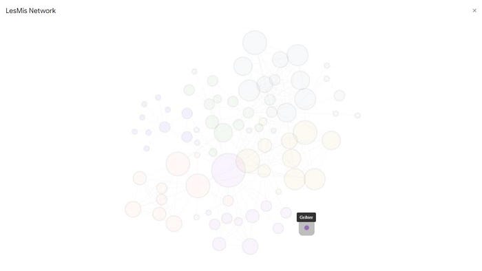
As they are at the borders of a network, peripheral players are considered critical profiles for two main reasons: they are linked to the rest of the area to which they belong (or the network as a whole) by one or a few people, which would be directly changed if that one connection leaves the organization (or, for some reason, no longer interact with the persona in question); the other reason is that generally, peripheral players are people with a lot of specific knowledge, and as their cohesion with the network is weak (few or a single connection), they are an exit risk, which can take a lot of knowledge and leave a technical gap in the company/team.
Conclusion
Graphs visualization may not be readily available in most popular data visualization tools. However, there are several libraries in Python, R, JavaScript, and other technologies that can generate this kind of chart. The proposal consisted of providing one of these ways, with a few lines of code, 100% free and customizable tools, in order to increase the range of possibilities for those who want to obtain insights from an organizational network in a convenient way.
Apart from that, we can obtain a lot of great insights from an organizational network analysis. Getting our data from sources such as Slack, Zoom, G-Suite, and others, we could easily anticipate problems such as key talent attrition, lack of cohesion between teams that are supposed to work together, different cultures across the organization, and a lot of other issues.
The full project (codes & spreadsheet) is available here.
References
[1] https://www.ime.usp.br/~yw/publications/books/TeoriaDosGrafos.pdf
[2] https://pt.wikipedia.org/wiki/Teoria_dos_grafos
[3] https://www.numerapeopleanalytics.com/blog/anlise-de-redes-organizacionais
[4] https://www.gartner.com/en/documents/3980852/magic-quadrant-for-analytics-and-business-intelligence-p
[5] https://developers.google.com/apps-script/overview
[6] https://developers.google.com/apps-script/guides/web
